I use black contour lines because they give the body a boundary, a rhythm, and a voice. They make visible where one gesture ends and another begins.
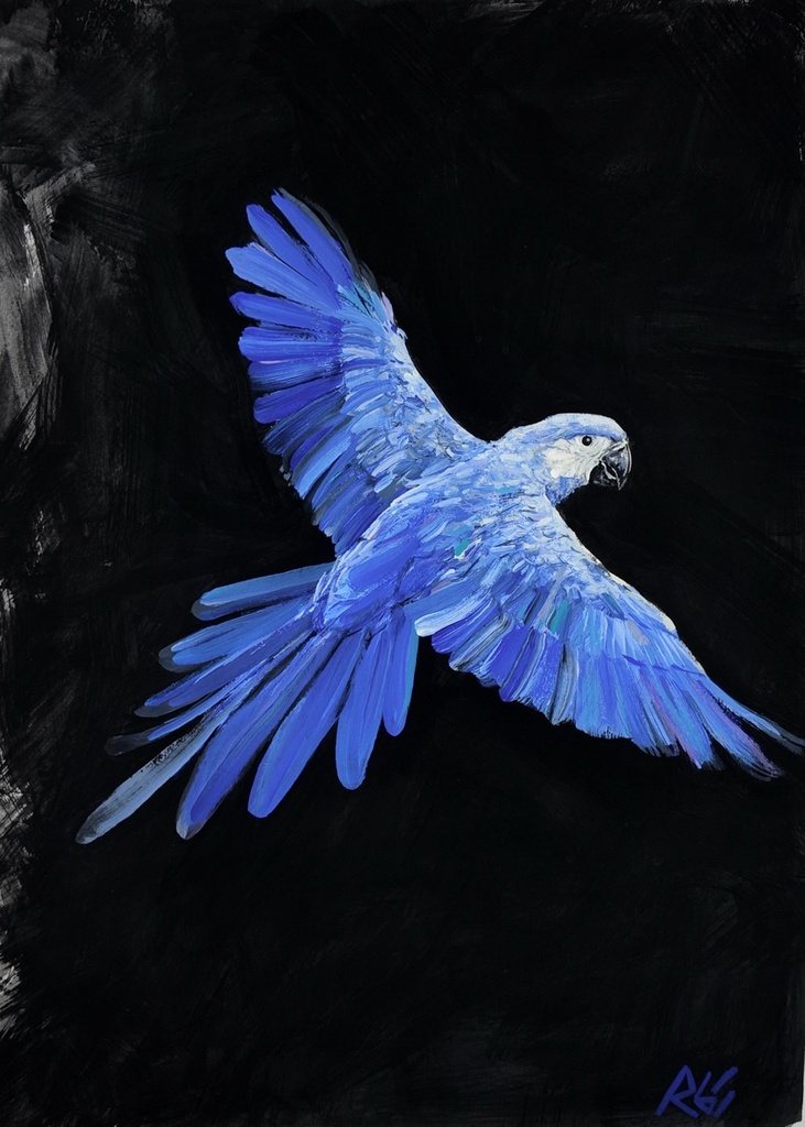
In Peacock Feathers, the black field does not sit behind the bird as neutral backdrop. It presses forward. The feathered form holds against it through sharp, deliberate edges, with color kept active inside the dark perimeter. That pressure is part of the painting's subject. I want the contour to register as a decision, not an outline added after the fact.
Why use black contour lines?
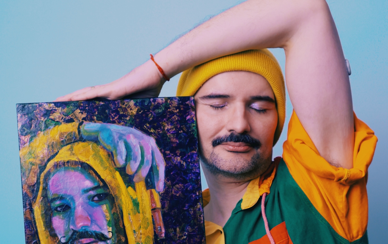
A black contour line lets me organize a crowded image without reducing it to illustration. My figures often begin as photographic montages of my own body, multiplied into scenes that hold desire, confrontation, memory, and performance at once. The line gives each fragment a place. An arm can meet another arm. A face can turn away. A hand can remain present even when the surrounding color becomes unstable.
The line also carries narrative. It tells the eye what belongs together and what refuses to merge. In figurative painting, that distinction matters. A body is never only anatomy. It is posture, history, costume, refusal, and the space it claims.
Black has a particular authority in this work. It can be graphic without becoming flat. It can interrupt a field of chromatic gray, yellow ochre, magenta, or ultramarine and make the color more precise. I use ivory black in a palette that also includes raw umber, burnt sienna, buff titanium, titanium white, cadmium yellow, cadmium red, and magenta. Black is not the absence of color here. It is a color with the task of holding the image together.
The line confines the body so it can move. That is the paradox I return to. Without a boundary, the figure can dissolve into atmosphere. With one, it can push back.
The contour begins after the ground has spoken
The black line is visible, but it is not the first decision. I begin with a heavily textured gesso ground. I drag, build, and interrupt the surface until its ridges establish how light will behave across the painting. The ground is matter first. It creates resistance before a figure enters the composition.
Then I work through colored pencil, gouache, flat matte acrylic, marker, and gesso again, in the order the painting requires. This sequence is not a fixed recipe. A dry pencil mark may need the blunt opacity of gouache. A flat acrylic passage may need to be broken by marker. Gesso can cover, reopen, or roughen an area so that the next color cannot behave too politely.
The contour line must answer that surface. On a smoother passage, it can move with speed and clarity. Across a textured ridge, it catches, breaks, or thickens. Those shifts are useful. I do not want a line that pretends the painting has no material history beneath it.
Every painting ends in oil. Oil is the final skin, bringing depth to areas that have already been tested by drier materials. Fat-over-lean governs only this oil phase. The black contour may remain exposed, be partly absorbed into the surrounding color, or be restated near the end. It depends on what the image needs. A line that is too complete can close the painting down. A line that is too hesitant can lose the body entirely.
Black is a structure, not a shortcut
There is a long visual history of black outlines in drawing, print, illustration, fashion imagery, and painting. I do not use them to make an image easier to read. I use them because they make looking slower. The eye follows a contour and encounters its changes: a hard turn at a shoulder, a soft break along a thigh, a double line where two versions of the body occupy the same space.
In I'm Perfect, But Unreal, that instability is central. Perfection is presented as an image with pressure behind it. The contour is one way I keep that pressure visible. It separates the figure from its setting, but it also shows the labor of constructing a self for the gaze of others.
That is different from using black as a universal solution. Some passages need no black at all. In skin, I often prefer chromatic grays built from neighboring colors. They keep the surface alive and prevent flesh from becoming a simple light-to-dark formula. A contour may appear beside those grays rather than through them, allowing the body to retain both volume and graphic force.
The choice also changes with scale. In smaller works such as Kratos and Zeus, a black contour can establish a figure quickly within a compressed space. It has to be economical. There is no room for a line to wander without consequence. In larger compositions, the line can become episodic, disappearing under paint and returning where the narrative needs a cut or a pause.
The line makes room for color to carry feeling
Black lets the warmer colors in my palette speak without sentimentality. Yellow ochre can hold heat beside it. Burnt sienna can deepen without becoming heavy. Magenta can feel theatrical, then become abruptly severe when contained by a dark edge.
Red requires particular care. When I paint the red of pain, I use transparent alizarin crimson mixed with raw umber, never cadmium red. Cadmium has another function in my work: directness, heat, a surface that announces itself. Alizarin crimson and raw umber produce a darker, more internal red. A black contour placed near it can make that transparency feel contained, not erased.
This relationship is present across the arc of works including Stone Woman, Compassion, David, and Becoming. The subjects shift, but the question remains: how can a painted body stay legible without being made simple? The contour answers only part of that question. Texture, color, montage, and the final oil skin answer the rest.
A boundary can be political without becoming a slogan
As a queer, Brazilian-born painter working in Toronto, I do not separate formal choices from lived experience. But I also do not ask a line to explain everything. A contour can suggest defense, seduction, distance, or solidarity depending on where it appears and what it touches. Its meaning changes through the painting's material conditions.
Brazilian memory enters the work through specific images and sensations rather than a generalized idea of place. In Ararinha Azul and Tuiuiú, birds on black fields carry their own visual force. Their names matter. Ararinha azul is not simply a blue bird translated for convenience. Tuiuiú is not decorative tropical imagery. Each painting asks how an image travels, what it retains, and how a dark field can make its color insist.
The black contour helps prevent easy consumption. It creates a threshold between the viewer and the figure, then makes that threshold unstable. You can recognize the body immediately, yet the surface keeps interrupting recognition. The painting offers access, but not possession.
Looking closely at the edge
Collectors often respond first to the directness of the line. From across a room, it gives a painting its graphic clarity. Up close, its behavior is less certain. A contour may be matte beside a glazed oil passage. It may skip over a gesso ridge. It may be buried under a later layer and remain visible only as a dark trace.
That difference matters to me. The painting should sustain both distances. It should declare itself at first encounter, then reveal that its apparent certainty was built through revision. Black contour lines are not there to simplify the work. They are there to make its decisions visible.
Peacock Feathers is available as an original and as a print. For new work and first access from the studio, join the collector list.