I use chromatic greys to make a painting breathe without handing everything over to bright color. They give skin, black fields, and passages of shadow a temperature that a tube gray cannot hold.
In Hummingbirds, the birds sit against a black field, where the darkness has to remain active rather than merely recede. The painting is not built by placing a subject over an empty background. The field has its own pressure. Chromatic grey is one way I keep that pressure alive.
What chromatic greys do in a painting
A chromatic grey is a muted color mixed from colors that oppose or temper one another. It is not simply black and white, and it is not a refusal of color. It is color brought under discipline.
For me, this matters because the figure cannot be isolated from its atmosphere. A cool grey beside a warm passage of flesh changes the body. A brown-grey behind a shoulder can make red feel sharper without adding more red. The gray that withdraws is often what makes the body present.
I do not look for one correct neutral. I look for a grey with a task. It may need to hold the heat of yellow ochre, carry the blue distance of ultramarine, or sit close to raw umber so the space feels weighted. The decision comes from the painting in front of me, not from a formula.
How to use chromatic greys in a working palette
My palette includes raw umber, yellow ochre, burnt sienna, ivory black, buff titanium, titanium white, cadmium yellow, cadmium red, magenta, and ultramarine. These colors can produce many different greys because each mixture remembers where it came from.
A grey made from ultramarine and burnt sienna will not behave like one made from raw umber, ivory black, and buff titanium. The first can stay open and cool, with a violet pull. The second is denser and more earthen. Neither is automatically better. The question is whether the painting needs air, weight, distance, or friction.
When I need a warmer neutral, I begin with raw umber or burnt sienna and cool it carefully with ultramarine. When a passage needs to move toward a colder grey, ultramarine can lead, then yellow ochre or burnt sienna can keep it from becoming a simple blue. Buff titanium is useful when I want opacity without the brightness of titanium white. Titanium white changes mixtures quickly, so I use it with restraint when the grey must stay low in value.
Ivory black is also a color, not an absence. It can cool a mixture and deepen it, but too much can flatten a surface. In a black field, I may let black meet umber, blue, or a small amount of sienna so that the darkness shifts as the eye moves across it. The goal is not decorative variation. It is a field that can hold a figure and still remain a material fact.
Keep the temperature visible
A useful chromatic grey retains a temperature. If I mix until every trace of warmth or coolness disappears, the passage becomes inert. That can be useful in a small area, but not as the governing condition of a painting.
I compare neighboring passages rather than judging a mixture alone. A warm brown-grey may read almost blue beside a stronger orange. A blue-grey can appear warm next to a black mixed with umber. Color is relational. Skin is relational too.
This is why I do not reserve chromatic greys for backgrounds. In flesh, they can turn a cheek away from light, settle a neck into shadow, or separate the body from a field without outlining it with a new local color. I work from photographic montages of my own body, multiplied and reassembled. The black contour line carries the narrative, but the chromatic greys let the interior of the figure refuse stillness.
Chromatic greys in skin and shadow
Skin is never one pink, beige, or brown. In my paintings, it moves through yellow ochre, raw umber, buff titanium, magenta, ultramarine, and their quieter mixtures. A chromatic grey can be the bridge between a saturated plane and a dark contour.
I pay attention to the direction of the form. A grey on the turning side of a face needs to support volume, while a grey in the background needs to establish distance or resistance. If both passages are mixed the same way, the figure can lose its edge. If they are too different, the painting can split into separate systems.
The red of pain requires particular control. I use transparent alizarin crimson with raw umber, never cadmium red, when that red must remain deep and exposed. A chromatic grey near it can make the crimson feel more insistent. But it must not neutralize the red into politeness. Some passages need to stay difficult.
In works such as Stone Woman, Compassion, David, and Becoming, color is not an illustration placed on the body after the fact. It establishes where the body can stand. The same is true in the smaller works, Kratos and Zeus, where a limited area leaves no room for accidental mixtures.
Let the surface decide part of the color
My paintings begin with a heavily textured gesso ground. The ridges and drags decide how light will behave before I add a figure. That surface is not a preliminary event I cover up. It remains active through the work.
After the ground, I use colored pencil, gouache, flat matte acrylic, marker, and gesso again, in the order the work demands. Oil comes last, as the final skin. Chromatic greys in oil meet an already complex surface: a matte acrylic passage may absorb their softness, while a raised gesso edge may break a darker mixture into a sharper mark.
This is where a premixed grey often fails me. It can sit on top of the earlier materials without responding to them. A mixed grey, adjusted on the palette and then adjusted again on the painting, can follow the ridge, drag across it, or gather at its edge. Impasto is not required everywhere. Sometimes a thin oil passage is more forceful because the earlier layers remain visible beneath it.
Fat-over-lean governs only the oil phase of my process. It is a practical rule, not a visual language. The visual language comes from decisions about opacity, drag, temperature, contour, and where the painting must remain unresolved.
Avoid making every grey equally useful
The most common mistake is to make one beautiful grey and use it everywhere. It creates unity, but a shallow kind. Background, shadow, and flesh begin to share the same temperature and the painting loses its internal weather.
Instead, I allow related greys to disagree. A background may lean toward ultramarine and umber, while a shadow in skin carries more yellow ochre and buff titanium. They belong together because their values and saturation are controlled, not because they are identical.
Another mistake is to correct every grey with white. White can open a passage, but it can also make it chalky and cut its depth. Sometimes the better answer is to add a warmer color, a cooler color, or a small amount of buff titanium. Sometimes the answer is to leave the dark alone.
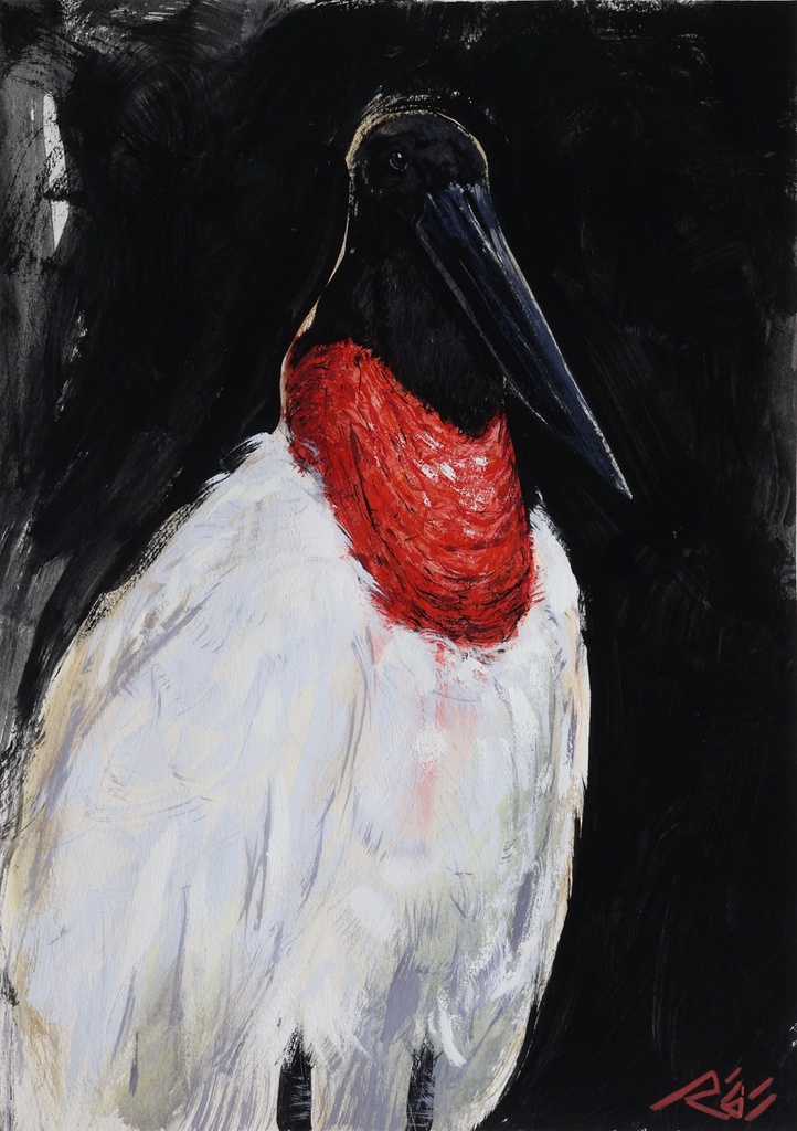
Peacock Feathers, Ararinha Azul, and Tuiuiú continue this question through tropical birds on black fields. The black is never only black. The greys around it are how the birds enter the space without becoming decoration. Each painting asks for its own balance between vivid color and restraint.
Original works are available through my studio, alongside prints of selected paintings. For a commission, inquiries are open with a 50% non-refundable deposit and two revision rounds. Join the collector list for first access to new work. When you look at a grey, ask not whether it is neutral, but what kind of presence it allows the rest of the painting to have.