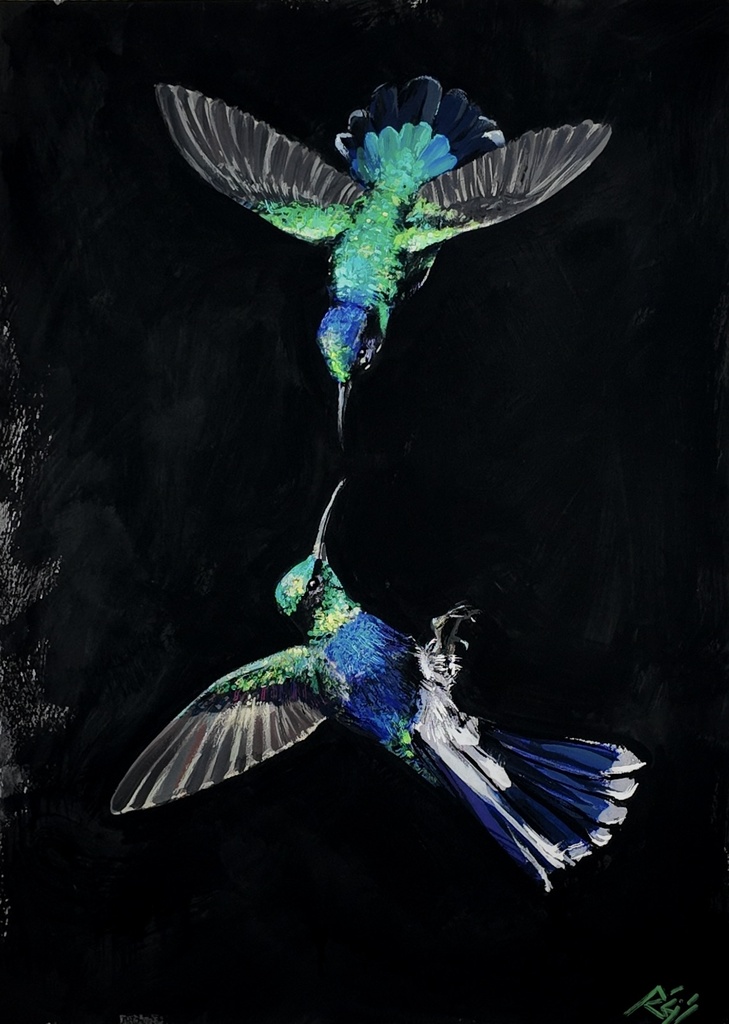
The best contemporary paintings for collectors are not chosen by trend alone. They are works with a distinct visual language, a material intelligence, and enough unresolved force to keep returning the eye.
I think of Hummingbirds: tropical birds held against a black field, their color made sharper by the darkness around it. The painting does not ask for a quick reading. Its black ground is not empty space. It is pressure, contrast, and a place where each mark has to account for itself.
A collector does not need a universal checklist. Collecting is personal, and taste should remain personal. But there are clear ways to recognize a painting that can stay alive in a room, deepen over time, and hold its place within a serious body of work.
What Makes the Best Contemporary Paintings for Collectors
The strongest paintings establish their terms early. You can feel when an artist has made decisions rather than borrowed effects: how a contour moves, where color is withheld, what the surface permits, and what it refuses.
This is especially true in figurative painting. A figure can be immediately familiar while the painting remains difficult. The body gives the viewer an entry point, but it should not close the conversation. I use photographic montages of my own body, multiplied and rearranged, because a single body can carry more than one position at once. The black contour line carries the narrative. It defines, interrupts, repeats, and sometimes contradicts the image it contains.
The paradox is simple: a painting can be direct without being easily exhausted. That is what I look for in work worth living with.
Collectors often respond first to image and color. They should. But a painting’s staying power is usually decided by construction. Look closely at the surface. Does it merely support the picture, or does it change how the picture is seen? Is the palette descriptive, or is it structural? Does the artist’s hand remain present once the first visual impact has passed?
These questions matter more than whether a work matches a familiar interior or resembles what is circulating most visibly at a given moment. A painting is not furniture, although it must survive the room. It is a presence with its own demands.
Material Decisions Are Not Background Details
My paintings begin with a heavily textured gesso ground. I build ridges and drags into the surface before the image is resolved. Those marks decide how light behaves later. They are not a decorative prelude. They establish resistance.
From there, the work may move through colored pencil, gouache, flat matte acrylic, marker, and gesso again, in the order the painting demands. Every painting ends in oil, its final skin. Fat-over-lean governs only that oil phase. The earlier materials do not imitate oil, and oil does not erase their prior decisions.
For collectors, this layered method offers something more substantial than visible complexity. It creates a painting with different speeds. From across a room, the image can arrive as a clear silhouette or a concentrated field of color. At close range, the surface interrupts that certainty. Pencil catches against gesso. Matte passages sit beside oil. A line that seemed clean becomes a record of revision.
In Ararinha Azul, Tuiuiú, and Peacock Feathers, birds become a way to test that relation between ornament and force. The black fields concentrate the color rather than making it merely decorative. Brazilian imagery is part of my cultural memory, not a costume placed on the surface. The names matter. So does the material pressure beneath them.
A collector considering an original should ask how the work has been made, not as a test of technical purity, but as a way of understanding its visual logic. Process tells you what the artist has risked.
Color Should Carry Consequences
A memorable palette is not necessarily a loud one. It is a palette in which each color has a job.
My color world returns to raw umber, yellow ochre, burnt sienna, ivory black, buff titanium, titanium white, cadmium yellow, cadmium red, magenta, and ultramarine. Chromatic grays move through backgrounds and skin. They keep the painting from separating body and atmosphere too neatly.
Red requires precision. The red of pain in my work is transparent alizarin crimson mixed with raw umber, never cadmium. Cadmium red has its own density and authority, but it does not do the same work. Alizarin crimson allows the darkness underneath to remain active. The color stays open, even when the subject does not.
That distinction may appear small, but collectors learn to recognize such decisions. Over time, they become the grammar of a practice. You begin to see why a particular blue, contour, or gray could not have been replaced without changing the painting’s emotional temperature.
In I’m Perfect, But Unreal, the title names a polished surface and its instability at once. Perfection is offered, then refused. The work belongs to an ongoing inquiry into self-authorship, desire, and the social demand to appear complete. It is not an illustration of those subjects. It is a painted argument with them.
Collect the Arc, Not Only the Image
A single painting can stand on its own. Still, the best contemporary paintings for collectors often become more legible when seen as part of an artist’s larger arc.
My works Stone Woman, Compassion, David, and Becoming each sit within a continuing investigation of queer embodiment and identity as movement. They do not repeat one statement. They return to related questions under different conditions: a changed pose, a denser ground, a more insistent line, a body divided across the composition.
This is where direct studio collecting can be especially meaningful. You are not acquiring an isolated object pulled from a category. You can see how a new work extends a vocabulary already under development. Small works such as Kratos and Zeus matter here as much as larger paintings. Scale changes the encounter, but it does not make a work secondary. A smaller painting can hold an entire decision in concentrated form.
For emerging collectors, this offers a practical way to begin. Choose the work that continues to occupy your attention after you have left the screen or gallery. Then look at the artist’s surrounding work. Is there a coherent visual language? Are the shifts between pieces purposeful? Can you imagine the painting gaining meaning as the practice develops?
For experienced collectors, the question may be more exacting. Where does this work sit in relation to the artist’s materials, themes, and exhibition history? What does it make visible that the rest of the collection does not already contain?
Living With a Painting Means Letting It Change
A good acquisition should not remain fixed at the moment of purchase. Morning light, evening shadow, a visitor’s different reading, and your own changing attention will alter it. This is not uncertainty in the market sense. It is the capacity of a painting to keep producing relation.
Original paintings are priced by size in my studio, and prints make related images accessible in another form. They are not interchangeable experiences. An original carries the actual drag of gesso, the shifts between matte and oil, and the scale at which the body was decided. A print carries the image into a different register. Both have their place, depending on how you want to live with the work.
For a commission, the exchange becomes more specific. I work with a 50 percent non-refundable deposit and two revision rounds. The structure protects the painting from becoming a service image while giving the collector a defined place in the conversation. Inquiries are open.
The work worth collecting is the work that does not finish when you understand its subject. Stay with the surface. Stay with the line. Let the painting make its own case over time.