Expressive painting makes the body legible through decisions of surface, color, and line. I use it to give private experience a visible structure, rather than an illustrative one.
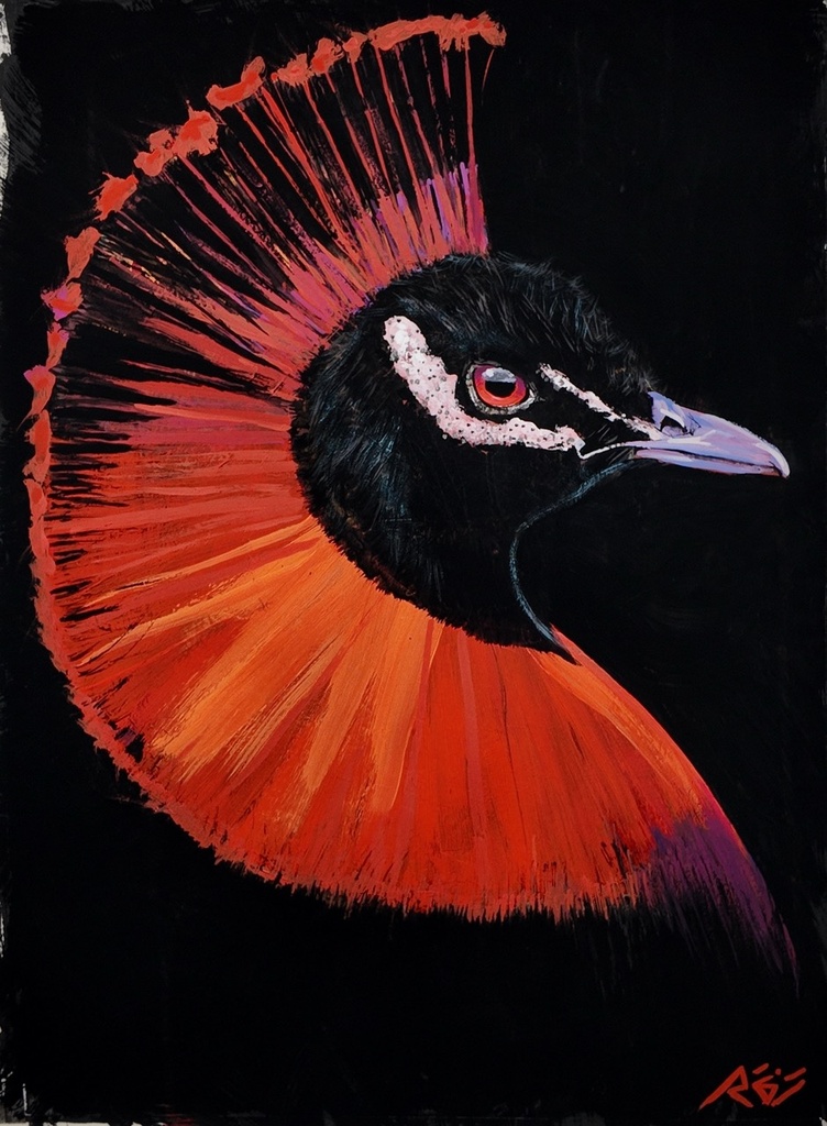
In Peacock Feathers, the tropical-bird image sits against a black field that refuses decoration. The darkness makes the color accountable. It asks each mark to state why it is there, and it places the image in the same ongoing arc as my figures: a body, or a symbol of one, insisting on its right to be seen.
Expressive painting is a material decision
The word “expressive” is often used as if it means spontaneous. It can. But spontaneity alone does not make a painting carry meaning. For me, expressive painting is built through a sequence of deliberate pressures: what the surface resists, where a contour closes, how a muted gray holds against a red.
A painting begins with a heavily textured gesso ground. I build ridges and drags into it before any image settles. This is not preparation in the background of the work. It decides how light behaves across the finished painting and where subsequent materials can catch, skip, or sink.
Then the work develops in the order it demands: colored pencil, gouache, flat matte acrylic, marker, and gesso again. I do not treat these materials as separate departments. They are arguments on the same surface. Colored pencil can hold a private pressure. Gouache can interrupt it with opacity. Marker can make a decision that cannot be softened later.
Oil arrives last, as the final skin. This matters technically and visually. Fat-over-lean governs the oil phase, but oil does not erase the earlier strata. It settles over them while allowing their history to remain active. The painting may appear immediate from a distance. Up close, it records negotiation.
That is the paradox I return to: the image can be direct because its construction is complex. Directness is not simplicity.
The contour gives the figure its narrative
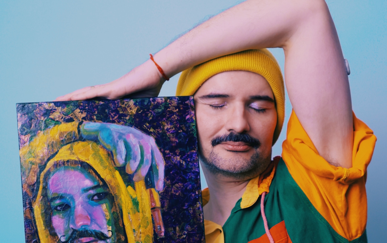
My figures begin with photographic montages of my own body, multiplied and rearranged. The source is personal, but the final figure is not a self-portrait in the conventional sense. It is a constructed presence. It carries desire, discipline, performance, refusal, and the shifting terms of belonging.
The black contour line carries the narrative. It is not merely a border around color. It separates one force from another: limb from field, face from shadow, tenderness from assertion. In works such as David, Becoming, and Compassion, the contour lets a figure remain specific without being reduced to a single story.
This is where expressive painting differs from emotional display. The feeling is not poured onto the canvas and left there. It is organized. A line can hesitate, double back, or lock into place. A body can appear fragmented and still hold authority. The image has to earn its intensity through its structure.
In Stone Woman, weight is part of the subject. The figure does not need to perform softness to become vulnerable, nor hardness to become strong. I am interested in that tension because figurative painting has often asked bodies to become symbols before they are allowed to be bodies. I begin from the opposite position. The body is already a site of knowledge.
Color has a history inside the painting
My palette is restrained but not neutral: raw umber, yellow ochre, burnt sienna, ivory black, buff titanium, titanium white, cadmium yellow, cadmium red, magenta, and ultramarine. These colors are selected for their relationships, not for an idea of brightness.
Chromatic grays are especially important in the backgrounds and skin. Gray can hold temperature, distance, and atmosphere without becoming empty. It lets a yellow ochre warmth remain low and persistent. It gives ultramarine somewhere to deepen. It prevents flesh from becoming a fixed statement.
Red requires precision. The red of pain in my paintings is transparent alizarin crimson mixed with raw umber, never cadmium. Cadmium red has a different force. It declares itself immediately. Alizarin crimson and raw umber can darken, stain, and remain unsettled. The difference is material, but it changes the emotional register of the image.
The black fields in Hummingbirds, Ararinha Azul, Tuiuiú, and Peacock Feathers make this especially clear. The birds are not illustrations of Brazil placed at a safe distance from the rest of my practice. They belong to cultural memory. Their names matter. Ararinha azul is the Portuguese name that carries the image differently than a translated label can.
Brazil remains present in my work as lived visual memory: its birds, its religious and theatrical density, its forms of display, its contradictions. My three years of Baroque training in São Paulo taught me to look at drama as construction. A fold, a shadow, a pose, and a directed gaze can all make an argument. I bring that discipline into a contemporary queer figurative language without treating either history as costume.
Why the surface matters to collectors
A painting reproduces differently from the way it is experienced in person. A print can carry an image with clarity and offer another entry point into the work. An original carries the physical event of its making: the drag in the ground, the matte interruption beneath oil, the pressure of a pencil line that remains beneath later decisions.
For collectors, that distinction is not about hierarchy for its own sake. It is about proximity to process. An original painting changes as a viewer moves around it. Light does not land evenly on a textured gesso ground. Oil can deepen one passage while a dry, matte area holds another forward. The work asks for time because the materials have kept time inside it.
Scale also changes the encounter. A small work such as Kratos or Zeus can concentrate the figure into an intimate field, where a contour and a color shift become almost architectural. Larger works allow the body to establish a different relation to the room. Neither scale is inherently more powerful. It depends on whether a collector wants the work to meet the eye closely or organize a larger space.
I price original works by size, and prints are available for the same bodies of work. Commissions are also part of my practice. They begin with a 50% non-refundable deposit and include two revision rounds, allowing the commission to retain both the collector’s intention and the visual discipline that makes the work mine.
A continuing chapter in figurative painting
My work does not offer identity as a solved condition. Identity is movement. A body can be staged, multiplied, adorned, scrutinized, and still exceed the frame placed around it. Queer resilience, painted, is not a slogan for me. It is a formal question: what must a surface do to hold a body without making it obedient?
That question continues into my 2026 exhibitions, Beyond the Contour at The Show Gallery in Toronto and Archive of Unstoppable Bodies with Pride Toronto ArtZone at CF Toronto Eaton Centre. These are not departures from the studio work. They are public chapters in the same investigation of contour, memory, and self-authorship.
Peacock Feathers is available, alongside other original works and prints from my studio. Inquiries are open for commissions. Join the collector list for first access to new work, where each painting can be encountered first as material evidence: a surface that has decided to speak.