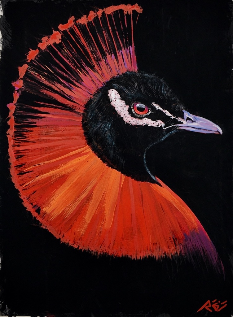
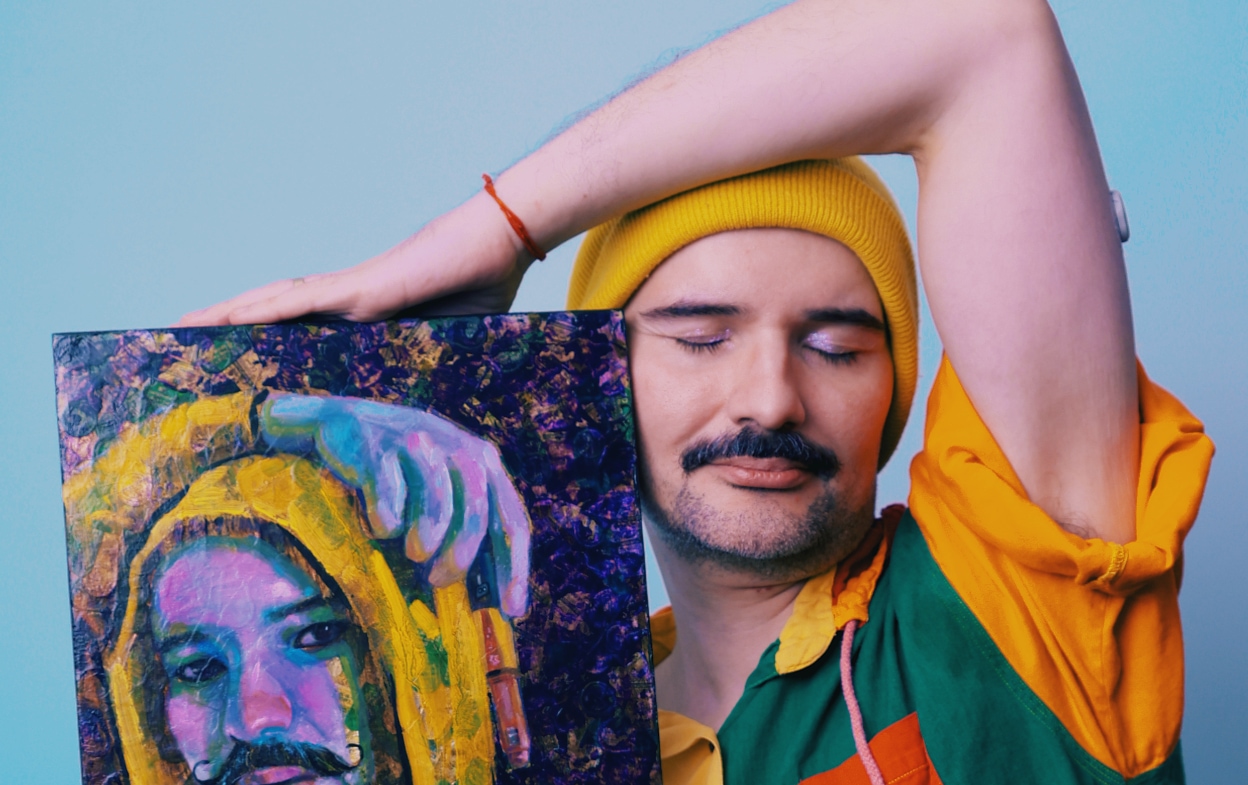
A ridge of gesso catches light before a figure appears. A dragged mark interrupts the surface. That decision remains beneath every layer that follows. Queer painting exhibitions begin here for me: not with an identity statement, but with matter that refuses to be neutral.
The figure arrives later. It is assembled from photographic montages of my own body, multiplied and repositioned. Black contour lines carry the narrative across a field already marked by pressure, revision, and resistance. Texture is never background. It is biography.
Queer Painting Exhibitions Are Not a Category Alone
A queer exhibition can be organized around a subject, a history, a place, or a generation. Those frames matter. They make space for artists whose work has been minimized, misread, or placed at the edge of institutional attention. But the strongest queer painting exhibitions do more than gather recognizable images of queer life. They ask what painting itself can hold.
Can pigment carry desire without making it decorative? Can a figure remain legible while refusing the old terms of portraiture? Can a room of paintings make self-authorship visible without turning a life into a symbol?
The answer depends on the work, and on the curatorial intelligence around it. Representation is necessary. It is not sufficient. A painting must still contend with scale, composition, surface, color, rhythm, and duration. It must stand in the room as a painting, not simply as evidence of a position.
That is where queer painting gains force. The subject is inseparable from form, but it is not reduced to form's illustration. A contour can be both a formal device and a boundary under negotiation. A repeated figure can be an image of solitude, desire, performance, or collective presence. The meaning does not arrive before the material. It emerges through it.
The Surface Carries Its Own History
My process begins with a heavily textured gesso ground. I build ridges and drags into the support before I decide where a face, hand, or fragment of architecture will live. Light later catches those elevations unevenly. The painting changes as the viewer moves. What appears flat from one angle becomes insistent from another.
Then the layers arrive in the order the feeling demands: colored pencil for fine line, gouache, acrylic for flat matte passages, markers for graphic interruption, and gesso again as construction. Oil comes last. It is the final surface, dense enough to gather the earlier decisions without erasing them. Fat-over-lean governs the oil phase alone.
This sequence matters in an exhibition setting. A painting viewed from a distance may announce a silhouette or a field of color. Up close, it gives another account. Gouache can sit beside a scraped passage. A marker line may resist a soft oil glaze. Sgraffito can cut through one sensation with another. Impasto occupies physical space, as a life does.
For collectors, this is part of what separates an image from an object. A digital reproduction can communicate composition. It cannot fully communicate how a dark line lifts over raw umber, or how buff titanium shifts against a matte acrylic passage. It cannot give the slow visual encounter that an original painting demands.
Color Is a Structure, Not an Ornament
Queer painting is often expected to perform color in a predictable way. It is asked to be bright, celebratory, legible at a glance. Sometimes that language is right. Sometimes it is too easy.
My palette moves through raw umber, yellow ochre, burnt sienna, ivory black, buff titanium, titanium white, cadmium yellow, cadmium red, magenta, and ultramarine. These colors do not arrive as a fixed code. They are structural. They push, obscure, warm, cool, and recalibrate the space around a figure.
The red of pain is not cadmium red. It is transparent alizarin crimson with raw umber, glowing from inside the layers. It is a red that does not shout. It stays.
Black and complementaries desaturate the field. Chromatic greys recur in backgrounds and skin tones, where certainty gives way to atmosphere. A white is never simply white. It can be a veil, a glare, a residue, or a pause inside a crowded composition.
This is one reason exhibition design matters. Paintings with layered color need room to breathe. Overcrowding can flatten their internal temperature. Harsh light can erase the difference between matte acrylic and oil. A considered installation allows the viewer to register not only what the painting depicts, but how it has been made to remain visible.
What Curators and Collectors Can Look For
The most compelling exhibitions do not treat queer experience as a single visual language. They make room for contradiction. Pleasure can sit beside vigilance. Glamour can meet grief. A private gesture can become public without becoming exposed.
For curators, the question is not whether every work names queerness directly. The stronger question is whether the exhibition allows artists to control the terms of visibility. Context should sharpen the encounter, not explain it away. Wall text has a role, but it should not carry the entire burden of meaning that the paintings have already begun to build.
For collectors, attention to material is equally essential. Look for the choices that cannot be summarized in a caption: the pressure of the line, the edge where one medium overtakes another, the color held beneath a glaze, the figure that appears to be leaving its own contour. Ask what returns when you look again. A painting worth living with continues to alter its answer.
There is also a practical distinction between acquiring a work because it represents a timely theme and acquiring one because its formal language will endure. These are not opposing motivations. A painting can speak urgently to the present and remain visually demanding over time. The best works do both.
An Exhibition Is a Chapter, Not a Verdict
My exhibitions are chapters in an ongoing arc. Beyond the Contour, presented in Toronto in 2026, considers the black line as both structure and pressure. Archive of Unstoppable Bodies, shown with Pride Toronto at CF Eaton Centre in 2026, places multiplied figures into public circulation. Prismatic Identity continues to expand through painting, mixed media, digital work, video, and performance.
These projects do not begin from a wish to make queerness acceptable. Queer life does not need permission from painting. The work begins with the more demanding task: to make a surface capable of carrying complexity without smoothing it into a lesson.
Brazil remains present in this language as cultural memory, not scenery. It appears in temperature, density, color, and the refusal of a single clean outline. Toronto is another register: a city of crossings, exhibitions, commerce, winter light, and public encounter. Neither place is a backdrop. Each changes how the figure occupies the frame.
Why These Exhibitions Matter Now
Queer painting exhibitions matter when they resist the demand for immediate resolution. They offer images of identity as movement, not a finished label. They insist that a figure can be fractured without being diminished, sensual without being consumed, and political without becoming a poster.
For institutions, this means committing to queer artists beyond a seasonal program. For collectors, it means supporting practices with continuity, where each work deepens a larger vocabulary. For viewers, it means allowing a painting time before asking it to declare itself.
The surface will tell you where to begin. Follow the gesso ridge. Follow the black line. Stay long enough for the image to become more than an image.
Selected original paintings and prints are available directly from the studio. Inquiries are open, and the collector list offers first access to new work.