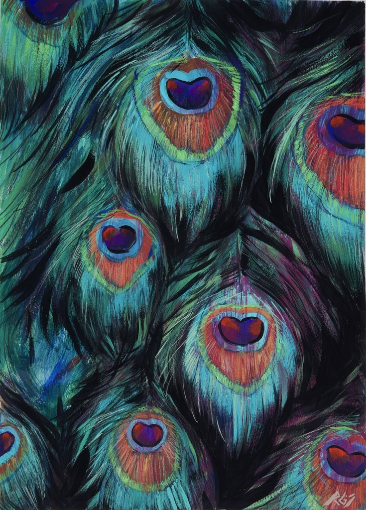
A print begins with a surface. Paper has tooth or smoothness. Cotton rag holds a black differently than a bright white stock. Ink can sit crisp at the edge of a contour or soften into the fibers. Before learning how to buy art prints, look past the image on a screen and ask what object is actually being offered.
A good print is not a lesser version of art. It is a distinct form of access to an artist’s visual language. It can bring a work into a home, a collection, or an institutional context at a different scale and price point. But prints are not all made, documented, or presented with the same care. The details tell you what you are acquiring.
How to Buy Art Prints with a Collector’s Eye
Start with the artist, not the algorithm. A print carries more weight when it belongs to an active practice with a clear visual language, rather than existing as decoration detached from authorship. Look at the work across series. Notice the recurring questions, materials, and formal decisions. Is the print drawn from a painting, photograph, drawing, or digital composition? Does it retain something essential about that source?
For my own work, the black contour line is never merely an outline. It holds the narrative together. A print can preserve the force of that line, the chromatic gray behind it, the collision of raw umber and magenta. It cannot reproduce the physical relief of impasto in the same way. That difference is not a flaw. It is the terms of the medium.
A print should be described plainly. You should be able to find its title, year, image dimensions, sheet dimensions, printing method, paper type, edition information, and whether it is signed. If those facts are absent, ask. Direct questions are part of collecting.
Know What Kind of Print You Are Buying
“Art print” is a broad phrase. It can describe a museum-quality pigment print, a screen print made through layered stencils, a lithograph, an etching, a risograph, or a reproduction produced in a larger commercial run. None is automatically superior. Each has a different relationship to the artist’s hand, source image, color, and production.
A fine-art pigment print, sometimes called a giclée, is made with archival pigment inks on a chosen paper. It is often the closest route for translating a painting or digital work with subtle shifts in color. A screen print is built color by color, so its flat passages and slight variations are part of its character. Etching and lithography involve established printmaking processes whose marks arise from the plate or stone itself.
Ask what process was used and why it suits the work. “High quality” is not enough information. A precise answer signals that the artist or publisher understands the object.
Edition size is information, not a verdict
Limited editions are usually marked as a fraction, such as 12/50. The first number identifies that individual print; the second is the total number in the edition. An artist proof may be marked AP. It is generally associated with the artist’s own working or archival copies, though its meaning varies by practice.
A smaller edition can feel more scarce, but scarcity alone does not create value. A larger edition may be intentional: an artist might want the work to circulate more widely. An open edition has no fixed cap. This can be an excellent choice when the work is made for ongoing availability, but it should be represented honestly.
Do not buy a limited edition only because it is limited. Buy the image because you want to live with it. Edition language establishes context. It does not replace conviction.
Read the Material Details
Paper is part of the artwork. Cotton rag papers often offer a soft, substantial surface and strong archival stability. Smooth papers can sharpen fine photographic detail and graphic lines. Textured stocks create a more tactile response, though they may alter the appearance of dense areas of ink.
Ask whether the stated dimensions refer to the image or the full sheet. A 16 by 20 inch print might contain a smaller image surrounded by a white border. That border can be intentional. It creates visual breathing room, offers a place for a signature, and makes framing easier. It can also make the piece look different from its dimensions online.
Color requires the same attention. Screens emit light; paper reflects it. A deep ultramarine may shift under warm lamplight. A near-black may reveal brown, blue, or green when you stand closer. Request additional installation images if scale or color is difficult to judge. A responsible artist will not promise that a screen is a perfect substitute for pigment and paper.
For paintings with thick gesso ridges, layered glazes, or sgraffito, a print records the image but not the changing cast of light over the original surface. The print has its own authority: it carries composition, color, and gesture into a more intimate format. Know which experience you want.
Check Provenance Before You Frame It
Provenance sounds formal, but the principle is simple: know where the print came from. Buying directly from the artist’s studio provides a clean chain of authorship. Buying through a gallery, publisher, or established platform can do the same. In the secondary market, documentation matters even more.
Look for a signature, edition number when applicable, title, date, and a certificate of authenticity if the artist provides one. Keep invoices, emails confirming the work, edition documentation, and any framing records together. These papers are not glamour. They are the history of your acquisition.
Be cautious with vague phrases such as “in the style of,” “inspired by,” or “estate print” without supporting details. A reproduction can still be visually appealing, but it should never be confused with an authorized edition. The distinction affects both meaning and future collectability.
Let the Room Challenge the Image
A print that feels right at 10 inches can become timid over a sofa. A large work can take command of a narrow wall. Measure before you buy, then mark the proposed dimensions on the wall with painter’s tape. Include the frame in your calculation, not just the sheet.
Think about viewing distance. Fine colored-pencil marks reward close looking. A graphic figure with a strong black contour can hold across a room. If a print will sit near a window, avoid direct, sustained sunlight and use UV-filtering glazing where appropriate. Framing is not an afterthought. It changes the work’s edge, scale, and visual temperature.
A white mat can create distance and clarity. A float mount can reveal deckled paper edges. A frame in natural oak may soften a saturated palette; black aluminum can intensify its graphic structure. There is no universal correct choice. The best frame allows the work’s internal decisions to remain audible.
Ask the Questions That Change the Purchase
Before acquiring, make sure you can answer these five questions:
- Who made or authorized this print, and where is it being sold from?
- What printing process, inks, and paper were used?
- Is it an open edition, a limited edition, or a unique print?
- What are the exact sheet and image dimensions?
- Is it signed, dated, numbered, and accompanied by documentation?
Then ask one question no specification can answer: why this work? A print may catch your eye because of a palette, a figure, a memory, or an unresolved tension. Stay with that response. The works that endure in a collection are rarely the ones acquired to fill a wall.
For emerging collectors, buying directly from an artist can be an especially meaningful beginning. You receive the work close to its source and participate in a practice while it is still unfolding. At Régis Souto Arts, prints and original works are offered as chapters of the same continuing arc. Inquiries are open, and the collector list offers first access to new releases.
Buy the print whose material facts you understand and whose image keeps returning to you. Paper, pigment, edition, and frame will give it a place. Your attention gives it a life.