A collector guide to oil originals begins by looking closely at how a painting was made, not only what it depicts. When you acquire an original from my studio, you are acquiring a singular surface, a record of decisions that cannot be reproduced in a print.
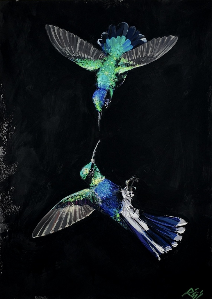
In Hummingbirds, tropical birds move across a black field that refuses to behave as empty space. The black holds the birds in sharp relief, but it also absorbs them. That tension matters when seeing the work in person: the painting changes with distance, then changes again when light moves across its surface.
What Makes an Oil Original Collectible
An oil original has one physical history. Its marks, edges, revisions, and final varnish of color belong to that single object. A print can carry an image accurately and still remain a different proposition. The original carries pressure, drag, hesitation, and correction. It holds the pace of the hand.
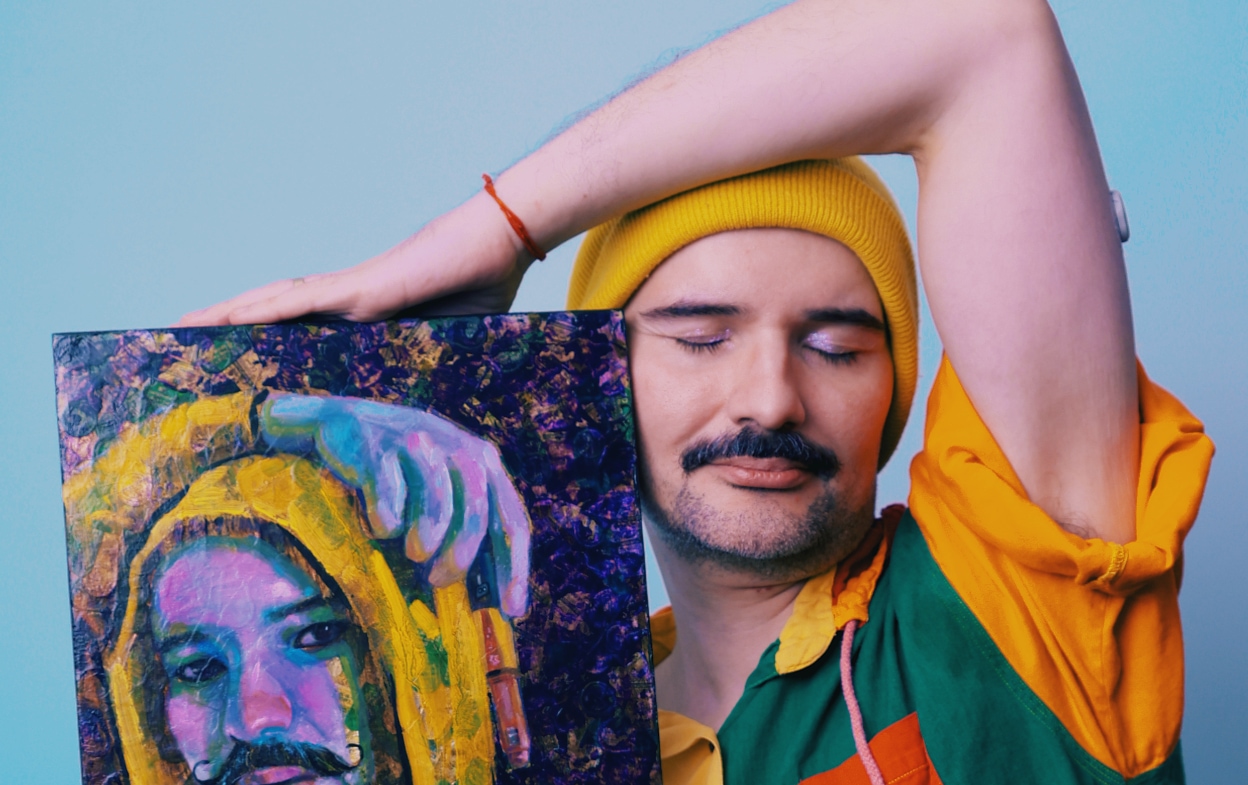
For collectors of figurative painting, this is often where attachment begins. You may respond first to a body, a gaze, or a bird. Stay with the painting long enough to see what the surface is doing beneath that response. My figures are built from photographic montages of my own body, multiplied and rearranged. The black contour line carries the narrative. It directs the eye, separates bodies, and sometimes refuses a clean separation.
The oil comes last, but it is not an afterthought. It is the final skin that brings the earlier material decisions into one visual climate.
An original also belongs to an ongoing practice. Stone Woman, Compassion, David, and Becoming are not isolated images made to satisfy a category of collector. They are chapters in a longer inquiry into queer resilience, self-authorship, desire, and the forms a body must take to remain visible. The material arrives before those larger questions become legible.
A Collector Guide to Oil Originals: Read the Surface
I begin with a heavily textured gesso ground. Its ridges and drags decide how light behaves before any figure appears. This is not a neutral preparation. It sets terms for everything that follows, including where a line breaks, where color catches, and where a face may remain partially withheld.
From there, the work may move through colored pencil, gouache, flat matte acrylic, marker, and gesso again, in the order the painting demands. Oil is always the ending layer, though not every area receives it in the same density. Some passages stay matte. Others take on a deeper optical weight.
This is useful knowledge for a collector because it clarifies what you are seeing. A ridge may come from the gesso ground rather than thick oil impasto. A dry-looking passage may be intentional, set against a more saturated oil passage nearby. The varied sheen is part of the composition, not a flaw to be corrected.
My oil phase follows fat-over-lean. That principle applies to the oil layers, not to every material used beneath them. A painting made across different media asks for precise looking. It is not a demonstration of technique for its own sake. Each material changes the speed and resistance of the image.
When viewing an original, take time with it in both direct and indirect light. Notice whether the contour line sits over a field, sinks into it, or breaks against a gesso ridge. Look at the transitions rather than only the center of the composition. The edges often tell you how a painting has been constructed.
Color Is Structure, Not Decoration
My palette is grounded in raw umber, yellow ochre, burnt sienna, ivory black, buff titanium, titanium white, cadmium yellow, cadmium red, magenta, and ultramarine. Chromatic grays move through backgrounds and skin. They keep the image from becoming fixed inside an easy contrast between light and dark.
Collectors sometimes ask about the intensity of red in these paintings. The red of pain is transparent alizarin crimson mixed with raw umber, never cadmium. It remains deep without becoming opaque. That distinction changes the emotional temperature of a passage. Cadmium red advances immediately. Alizarin crimson can hold its distance while still staining the field.
In I’m Perfect, But Unreal, color and outline work against certainty. The image is declarative, yet its material structure remains unsettled. That friction is central to the painting. I am not interested in offering identity as a polished answer. I am interested in identity as movement, visible in the way one color interrupts another.
The tropical bird paintings - Hummingbirds, Ararinha Azul, Tuiuiú, and Peacock Feathers - use black fields differently. Their subjects carry Brazilian cultural memory without being reduced to decoration or origin story. The ararinha azul is named for what it is. Language matters. The Portuguese name retains a specificity that an imported label can flatten.
How to Evaluate a Painting Before You Acquire It
Start with the practical facts: title, year, medium, dimensions, and current availability. These details situate a work within an artist’s practice and help you consider where it will live. Size affects more than placement. A small work such as Kratos or Zeus creates a concentrated encounter, where a collector meets the image at close range. A larger painting can establish the rhythm of an entire room.
Then consider the relationship between subject and scale. A figure that feels confrontational at one size may become intimate at another. A black-ground bird painting may read as a precise visual event in a hallway, or as a sustained field of color and texture above a dining table. There is no universal right location. There is only the question of how long you want to remain with the work.
It is also reasonable to ask about the materials, the order of process, and how a painting should be handled. These are not administrative questions. They are part of collecting with attention. An artist-led studio can speak directly to the work’s construction because the knowledge has not passed through several hands.
For a first original, the strongest choice is not necessarily the most decorative work or the work that seems easiest to place. Choose the piece whose material decisions continue to disclose themselves. A painting should keep giving you information after the first recognition.
Direct Studio Acquisition and the Record of the Work
Original paintings in my studio are priced by size. Available works can be acquired directly, while prints offer another way to live with the same image. The distinction is clear: a print extends the image; the original remains the site where the image was made.
Direct acquisition also places the collector close to the continuing arc of the work. My exhibition Beyond the Contour opens at The Show Gallery in Toronto in April 2026. Archive of Unstoppable Bodies follows at Pride Toronto ArtZone at CF Toronto Eaton Centre in June 2026. These presentations situate individual paintings inside a larger public language of bodies, contour, and refusal.
Commissions are available when a collector wants to enter a more specific conversation with the studio. They begin with a 50% non-refundable deposit and include two revision rounds. A commission is not a request for repetition. It is a new work shaped by a clear exchange, while remaining faithful to the material and visual logic of my practice.
For collectors following new paintings, the email collector list offers first access. This piece is available when the work, its scale, and its surface continue to make demands on your attention. That is usually the right reason to bring an original home.